
Quick answer: choose one cursive model, learn how its lowercase and uppercase letters sit on ruled lines, practice a few related shapes at a time, and then move from single letters to joins, words, and short sentences. Cursive models differ by curriculum, country, and period, so use a trusted reference consistently instead of mixing whichever forms look attractive.
Start by choosing one reference system
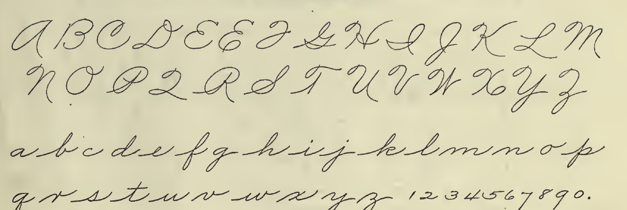
There is no single cursive alphabet used everywhere. A capital G, lowercase r, or the amount of slant may look different in Palmer, Zaner-Bloser, New American Cursive, and other school or regional models. Older business-writing systems can also differ from the handwriting taught in a modern classroom.
For a beginner, consistency matters more than finding a supposedly perfect system. If a teacher or school has assigned a model, follow that model. Otherwise, compare complete alphabets from established handwriting programs, choose one that is readable to you, and keep its chart beside your paper. The New American Cursive alphabet, for example, identifies itself as a simplified model for beginning writers. The Zaner-Bloser practice package provides another model with trace-and-write pages for uppercase and lowercase letters.
Observe the alphabet before copying it
Look at both cases together. Lowercase letters make up most words and usually deserve the most practice time; uppercase letters appear less often and may use quite different constructions. On ruled handwriting paper, notice where each letter begins, where its main body sits, and whether it extends above or below that body.
- Baseline: the line on which most letters rest.
- Middle zone: the main body area used by letters such as a, c, m, and o.
- Upper zone: the area reached by ascenders in letters such as b, h, and l.
- Lower zone: the area used by descenders in letters such as g, j, and y.
These zones help you compare proportion without insisting on one exact size. Check your chosen model for its own line names and proportions. Before writing a letter, trace its path in the air or follow it slowly with your eyes, using the directional guidance supplied by that model rather than guessing from a finished shape.
Practice by shape families
Grouping letters by a shared movement can make a long alphabet less overwhelming. The groups below are a practical way to organize practice, not an official or universal classification. Your chosen curriculum may group letters differently because its forms and teaching sequence differ.
- Oval-based forms: compare letters such as c, a, d, g, o, and q. Look for the part of each letter that grows from an open or closed oval.
- Undercurve forms: compare i, t, u, and w. Pay attention to the repeating approach to the baseline and return toward the middle zone.
- Hump or overcurve forms: compare n, m, and related humps in your reference model. Keep the spaces between repeated parts visible.
- Loop and ascender forms: compare l, e, b, h, k, and f, while checking which letters actually loop in your chosen system.
- Forms that need individual attention: letters such as r, s, x, and z may not fit a beginner’s family neatly. Learn their specific model rather than forcing a resemblance.
Use the Cursive Alphabet reference to compare uppercase and lowercase results, then open a letter page when you want focused examples. A finished-letter page is useful for recognition and visual comparison; follow the cited instructional model for movement and stroke sequence.
Move from one letter to real connections
Rows of isolated letters are only the first stage. Cursive changes when an exit stroke meets the next letter’s entry. After a short row of one form, practice a two-letter join, then a short word containing that join.
- Write five careful examples of one lowercase letter.
- Choose a second letter from the same reference system and write five of it.
- Join the pair in both orders when the combinations make sense, such as an and na.
- Place the join inside a familiar word, such as hand, name, or rain.
- Finish with one short sentence, leaving a clear gap between words.
Do not assume every pair should be connected without interruption. Some uppercase forms, punctuation marks, and letter combinations may involve a pen lift in a particular model. Copy the connection shown by your reference and favor readable spacing over an unbroken line.
A focused 15-minute practice routine
A short session can have a clear purpose. Use this routine as a planning template and adjust the pace to the learner and the assigned curriculum:
- Minutes 0–2: observe. Name the target letters, compare their case and line zones, and identify the example you will follow.
- Minutes 2–6: write slowly. Trace only if your licensed or original worksheet provides tracing forms; otherwise copy beside the model. Compare each result before repeating it.
- Minutes 6–10: build joins. Practice two-letter and three-letter combinations while watching the baseline and spaces inside the letters.
- Minutes 10–13: write words. Choose two or three familiar words that use today’s forms.
- Minutes 13–15: review. Circle the clearest example, mark one feature to adjust next time, and stop instead of filling a page with rushed repetitions.
The Cursive Worksheet Generator can create printable practice lines from your own words. Select words that match the letters you are studying and check the preview against your chosen handwriting model before treating it as an instructional example.
Common beginner mistakes
- Changing models mid-page. Keep one reference visible and label comparisons from other systems separately.
- Starting with capitals only. Build a working lowercase set first because connected lowercase forms make up most of ordinary words.
- Chasing speed too early. Write slowly enough to check the form, join, spacing, and baseline. Speed is not evidence that a form is correct.
- Making every letter touch. Follow your model’s joins and use a pen lift where it calls for one.
- Ignoring space inside and between forms. Crowded humps and narrow word gaps make otherwise recognizable letters harder to read.
- Repeating without reviewing. Compare a few attempts with the model and choose one change for the next row.
Fonts and Unicode do not teach handwriting movement
A script font displays typed characters as designed outlines. A Unicode cursive converter usually substitutes mathematical alphanumeric characters that can be copied as text. Neither output records how a person formed the letters, where the pen lifted, or how a classroom model connects them.
Use the Cursive Generator to preview decorative text, compare styles, copy supported Unicode characters, or export an image. Use the alphabet and letter pages for visual reference, and use an established handwriting program or teacher for model-specific movement. For another example of why script, language, and font support must be kept separate, read the Cyrillic Cursive Guide.
How this guide was researched and checked
We compared the published alphabet descriptions and practice materials from New American Cursive and Zaner-Bloser with a digitized 1915 Palmer manual. We used the historical Palmer image only to show that a named system has its own finished alphabet forms. We did not infer a universal stroke order from that image, reproduce copyrighted workbook artwork, or claim that our practical shape families are the official sequence of any program. Links and source roles were reviewed for this page on the date shown above.