
Classic Script
Readable cursive Unicode for bios, names, and short lines.
𝒵 𝓏
Uppercase & lowercase · Zz
Compare cursive Z and z in cursive with documented Palmer and modern teaching-system references, then copy either case or download a transparent PNG.
Find capital, uppercase, and lowercase cursive Z in one source-safe page: compare documented forms, see why modern systems simplify some capitals, and treat font previews as visual aids.
Copyable Zz
𝒵 𝓏
Copyable text
Copy a Unicode style or export it as a transparent PNG.
Readable cursive Unicode for bios, names, and short lines.
𝒵 𝓏
Heavier script style for stronger signatures and headings.
𝓩 𝔃
Light handwritten look that stays easy to read.
𝑍 𝑧
Fixed-image previews
Real script fonts give the PNG a consistent appearance. Use the styles above when you need copyable text.
Zz
Zz
Zz
Zz
Public-domain source plate
These 1915 scan extracts show documented historical forms. They provide visual context only and do not prescribe pen movement or define a universal modern standard.
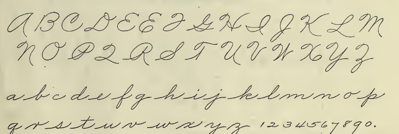
Z and z in the historical alphabet
Original alphabet-page excerpt from book p. 29. Z and z remain in their published rows and surrounding letter context.
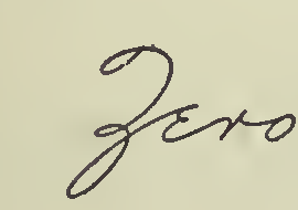
Uppercase Z inside “Zero”
Historical word example from The Palmer Method of Business Writing, book p. 89, Lesson 138.
Source: The Palmer Method of Business Writing, A. N. Palmer Company, 1915, public-domain scan via Internet Archive.
Use this page to compare a historical Palmer reference, a modern simplification note, and a decorative font preview for Z. The preview is a visual aid only and does not act as handwriting authority.
Historical cursive manuals show a dedicated uppercase Z rather than a printed zigzag. The public-domain Palmer scan provides the historical form used for this comparison.
Source: Palmer Method, p. 29Modern school systems may simplify the capital Z. Lowercase z in cursive is smaller and more connected than uppercase Z, so the two forms should be compared separately.
Source: New American CursivePublished cursive systems do not all use the same capital Z shape. This page compares documented forms, while the decorative font preview remains a visual aid rather than a handwriting authority.
Source: Zaner-Bloser PDFThese answers stay tied to documented form comparisons and do not present an unverified writing sequence.
Compare the dedicated uppercase Z documented in historical cursive manuals with the simplified capitals used by some modern school systems. Published systems do not all use the same capital Z shape.
For a cursive Z, compare the historical Palmer capital and lowercase z with a modern teaching-system example first. Their shapes are useful visual references, while the decorative font preview is not a handwriting authority.
Historical cursive manuals show a dedicated uppercase Z rather than a printed zigzag. Lowercase z is smaller and more connected than uppercase Z, while modern systems may simplify the capital.
Compare the historical Palmer sample with modern simplification notes, then use the preview only as a visual aid rather than a handwriting authority.
The historical Palmer scan shows uppercase Z and lowercase z as a public-domain reference for comparing the older cursive form with modern simplifications.
The modern simplification note points to contemporary teaching materials that present a simpler capital Z, which helps show that cursive systems are not identical.
Lowercase z in cursive is smaller and more connected than uppercase Z. Published cursive systems do not all use the same capital Z shape.
No. The decorative font preview is only a visual comparison and is not a handwriting authority or a source for a verified writing sequence.
A short practice flow
Move from recognition to a usable example: compare the pair, try the copy tools above, then practice a familiar word.
01 · Look
Start with the form comparison above. It separates the historical reference, modern simplification, and decorative preview.
View the pair above02 · Test
Try uppercase, lowercase, or both in the tool. The Unicode results are for copy and paste; PNG is an image export.
Test Z in the tool03 · Practice
Choose one word, write it slowly, then compare its legibility with the preview above.
Choose a practice wordChoose a word to preview it in the cursive text generator, or open a practice sheet with this letter and its example words.
Open a browser-only worksheet with Zara as the starting text, then choose tracing or copy practice and Print or Save PDF.
Jump back to the A-Z chart or compare live cursive letter pages with copy and PNG export.
Tool
Generate cursive text to copy and paste, then download PNG.
Previous letter
Next letter
Alphabet
Compare uppercase and lowercase cursive letters from A to Z.
Live letter
cursive f / f in cursive
Live letter
cursive n / n in cursive
Live letter
cursive r / r in cursive
Live letter
cursive t / t in cursive
Nearby